Mood:
Topic: Comic Books - New
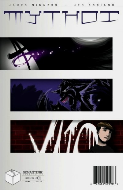
TODAY'S FEATURE - Blog #3165: Today I am blogging a review on a publication that was handed to me at the May 16th of 2010 Semantink's Comic Savvy! That would be the 1st issue of MYTHOI. I was not familar with this comic book or the project itself before receiving this copy. So what's this comic book about? Here is the promo blurb from the web site itself: "MYTHOI is Semantink’s inaugural title and the brainchild of writer James Ninness. Wiglaf, Vito, Yuki, Taros and Touch are five unique beings from various mythologies thrust together to defend humanity from an ancient enemy… MYTHOI is set now, not the now of mythological fiction, but the now of flesh and blood monsters where nightmarish beasts have skin, folklore wears clothes and the dreams of humanity hitchhike the roads of earth. With stories from James Ninness and art from the incredible Jed Soriano, Semantink couldn’t be prouder of this flagship title." So what's 'My Take' on this comic book?Front Cover: The front cover has an interesting title logo concept. The creators credits are seen above that. The three graphics do not give me an indication of what the interior of the pages will be about. The publisher's logo and the comic's cost at the bottom left of the front cover are placed in an unusual area for a comic book. Inside Front Cover: Looks like an ad...And yeah, it is an ad. Kind of unusual for that to be on the inside front cover, especially after the front cover doesn't indicate to me at least, what genre this comic book is in... Splash Page: Starts off with a quotation from William Wordsworth. Okay...I'll go along with that, (for starters). The Rest of the Pages: Turning over the splash page, the story gets going right away. I find I like the interior artwork right away. The word balloons are placed pretty well, and the colors on these pages are better than the splash page. Talking about the splash page...I started to think that the splash page looks so much like a continuation of the inside cover page that both pages looked at first glance to be a 2 page ad, now that I think more about it. The splash page just didn't seem to go with the opening interior pages. I hit the centerfold, a nice two page spread. Good visual effects and colors. I go on to the next pages. The story picks up the pace. A lot of action. Then on the next to last interior page it cuts off abruptly, with no 'to be continued' blurb. Last Page: Is actually a page about Semantink Publishing and what it wants to do. Plus a bio on the 'Team Mythoi': Jed Soriano and James Niness. All of this is fine, but I'm still thinking about the abruptness of the story being ended for this issue... Inside Back Cover: This is a presentation of the next issue's cover. With a banner at the bottom right stating 'Coming In November!'. So the reader knows now that this is a bi-monthly publication, but not if it is an ongoing publication, or a limited series. Back Cover: It's an add for NSP (North Shores Printery), the printer for this publication. It's a local company in the San Diego area, which is where Semantink is also located. Ad pages are needed, and after all, this is where another printer, say like Ka-Blam, would have their ad placed. So this back cover page is fine in presentation. So, after all of the above...what is 'My Take' on all of this? Well...First of all, I would have to say after meeting the writer of this series, I find that James Ninness has a passion for this industry. Leaving that aside, and seeing this as one that either ordered it from the publisher's web site, or found at my LCBS, I have this to write: The storyline is one that could hold my interest to buy additional issues if the presentation was done a little differently. The front cover's title font and layout doesn't tell me what the series is about at first glance. Neither do the graphics shown on the front cover. When I go to the inside front cover and the splash page and look at it as a 2 page spread instead of 2 individual pages, it truly looks like a 2 page ad spread to me. However, once I get past that, the art and coloring pulls me into the storyline, and I start enjoying the writing, art, coloring and action. The abruptness of what turns out to be the last page of storyline, with no 'to be continued' blurb or any indication if this is an ongoing series, or if it is Issue 1 of 6, leaves me a little 'lost'. The last page is good, in showing what the publisher, artist, and writer are about. It probably should have been placed as the inside front cover in this instance. An 'intro' page as to what the series was about would have better as there is no real 'presentation' to a potential buyer at a LCBS to continue on with it. Showing that there is an issue 2 projected for publication two months later was good. I would grade this first issue of Mythoi as a 'Fine / Very Fine' (F/VF) 7.0 out of the 10.0 Grading Scale, because the layout and presentation of the issue at the beginning and end affected my enjoyment of the issue. After reading the storyline with the good art, I would want to read the next issue, but if it was one of hundreds of new comics at a LCBS, would it have been bought by another browser in the LCBS, or placed back on the rack? That is the question I pose... Here's the publisher's site: Semantink.com. The publisher has a really well laid out web site. Plus there is a special section just for Mythoi, where you can find out more about the characters and the title itself. If YOU can't find Mythoi at your LCBS, then I would suggest buying an inexpensive digital copy, (if you like reading that way), at the web link here. The publisher also has a Facebook Fan Page, and an ongoing comics fan group that meets in person in the San Diego Metro area title: Semantink's Comic Savvy! I attended the May group meeting, had a fun time meeting others from Semantink Publishing, and other comics fans in the area. It was NOT about Semantink's comics, it was about comics in gen eral, so it is NOT a 'sales pitch' for Semantink. If YOU are in the San Diego Metro Area, I would suggest checking this monthly meeting out! My thanks to James Ninness, for bringing this comic book of his for possible review at the last meeting. The team of James, Jed Soriano, and Christopher Henderson, (letterer), should make this a publication an interesting one to watch unfold. (Addendum: I have been told on June 17th that Jed Soriano did the colors for issue #1, but with issue #2 is doing only the pencils and inks.) Plus my thanks to Ben Glibert, Publisher, for publishing this series. It's good to see another publisher in the San Diego Metro Area! AND My thanks again to all of YOU reading this blog and our archived blog posts, now over the 3,160 total posts in number! ~ Michael D Hamersky @ ComicBookCollectorsBlog.com
http://www.comicbookscircus.com/
|

 Note: Our online comic book store carries many different genres of comics, magazines and graphic novels at:

 Also, if you are a Facebook member and would like to also join my Facebook Network, feel free to send a
  Talking about comics: if YOU are a comics creator, (writer, penciler, inker, colorist, letterer, etc.), OR even a Comics / Magazine Publisher, feel free to contact me regarding YOUR works for a possible mention / review!
 WEB PAGE NOTE: This blog post is written for the IE Browser standards. Chrome, Safarai, Netscape, Firefox and the others serve the page up differently, sorry about that!
 Talking about comics: if YOU are a comics creator, (writer, penciler, inker, colorist, letterer, etc.), OR even a Comics / Magazine Publisher, feel free to contact me regarding YOUR works for a possible mention / review.
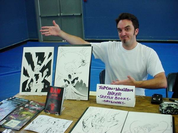
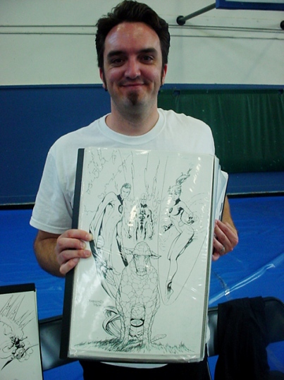
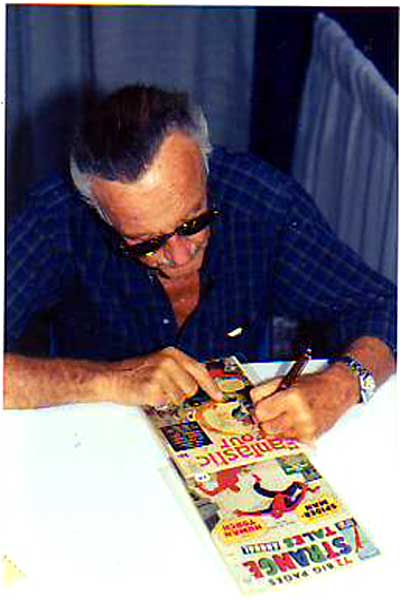
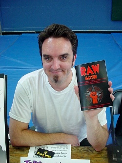 I am glad that he had the Fantastic Four page opened on his table at this Con that got my attention!
 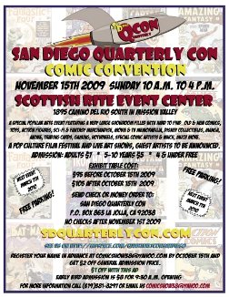 For those of YOU that haven't heard about this start up comic con that I met Ryan Winn above, it's a 'start-up' in the sense that the promoter, Paul Martinez, is re-starting a comic con that he used to run about 10 - 11 years ago when it ended its' original run.
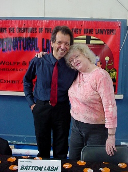 As mentioned in today's Main Feature above... To the left is Batton Lash and his wife, Jackie Estrada, as seen at their table at this SD Quarterly Comic Con!


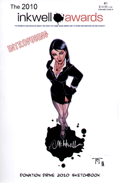

 Heroes Con capped the Inkwell Awards show schedule for now which will resume at Wizard World: Big Apple on October 1-3.
 As mentioned in today's Main Feature above... To the left is Joe Sinnott, of whom the 'Joe Sinnott Hall of Fame Award' is named for.
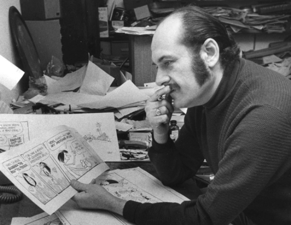
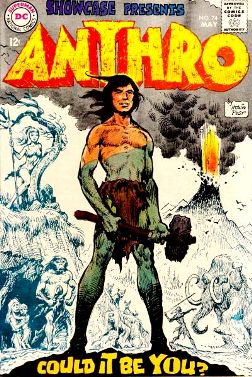 But for me, it was his credits on the 'Anthro' comic book series that I best knew of his work.
 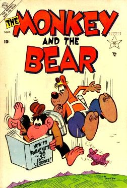 However, I did find a unique series from Atlas Comics, that probably portrayed his art style during that time period.
 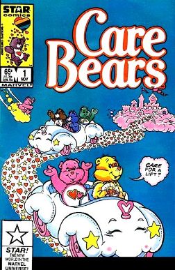 My daughter would know him best for his work on the 'Care Bear' series from Marvel Comics.