Mood:
Topic: Comic Books - New
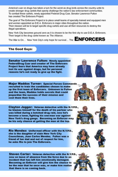
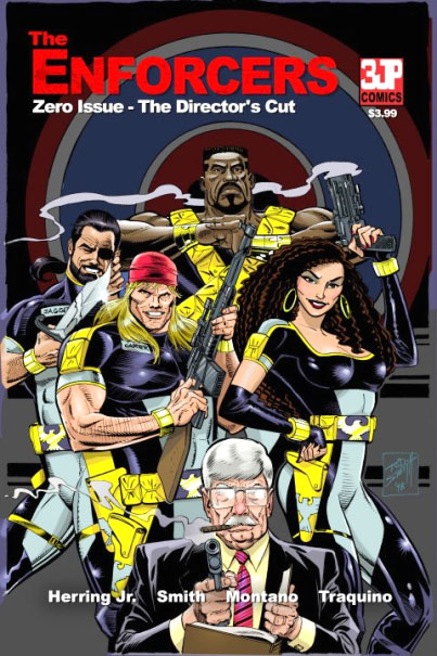
TODAY'S FEATURE - Blog #3126: This morning I'm blogging 'My Take', (a.k.a. review), on 'The Enforcers: Zero Issue - The Director's Cut, sent to me by the President of Three J Productions LLC, Carl Herring Jr... This print copy is officially available in May and can be purchased via the Facebook Fan Page that I will link to at the bottom of this review. This 'Zero Issue' is the introduction to the five part mini-series that will follow this Summer. If the name of the title sounds familar, it's because "The Enforcers: Zero Issue was originally released in limited edition in 2005. 5 years later, Three J Productions, LLC is proud to now release The Director's Cut, expanded and colorized". So what's it about? Here's the Press Release Info: "Senator Lawrence Fulton brings together the most unlikely candidates to make up his elite group of D.E.A. agents known as The Enforcers. Their mission is to put an end to the east coast drug cartel known as The Alliance.” So what's 'My Take' on this? First: The Front Cover - From the number of characters on the front cover, I could see it was going to be a 'team book', which generally when one of those are first introduced, a new reader may be a little hesitant to jump in on, because of lack of knowledge of the characters presented on the front cover... So, if I was looking at this comic book on the shelf at my LCBS, would I pick it up and look inside? After all, it's the logo / title / artwork / front cover scene that would entice me to do so... or not. In this case the characters and the title showed me enough to want to open up to the inside page. Which led to the explanation of the names credited on the bottom of the front cover, plus more. Good presentation there on the inside front cover! Then what would have been the 'splash page' turned out to be the first of two pages of intro / character bios & sketches to The Enforcers, (see 2nd photo top left of this blog), who are the 'Good Guys',and then the 'Bad Guys' on the next page. Great idea! With TEN different characters presented with character sketches and brief bios - I as the reader had a 'scorecard' to help me through the story which was next! The story started immediately with a full page art page, which served as the 'splash page', and then the action started when turning that page! Action... plus character introductions... Plus good pacing! Actually very good pacing, considering there are to be five more issues of this mini-series! What would be considered 'house ads' were left for the ending pages of this issue... Three pages of those, then the Editor's Page with 'the history of Three J Productions LLC'. The inside back cover could also be considered a semi-house ad, telling the reader that this comic was 'designed, colored, and lettered by Ed Traquino', with an email addy and web site. The Back Cover was the Ka-Blam (the printer) ad, with the Ka-Blam Girl pictured, which was the only thing that seemed out of place in this entire issue. Don't get me wrong... when I see this printer's page, I know that the printing job will be a good one, but the Ka-Blam Girl seemed a little out of place after seeing all of the earlier pages on the back cover itself. (Note: I do know that the page itself can be removed if the publisher pays more for the removal of the printer's house ad on the back cover, which most comics creators elect not to do, because of the additional cost.) So, you ask me... What's My Take on this issue? I'll tell you this much... I'm ready for the next issue to be published! Why? This was a Good Set Up of character sketches / bios to introduce the characters, plus sets up an actual storyline... EXACTLY what a 'Zero Issue' should do! I'm suggesting that you get on board with this mini-series at the very begining with this Zero Issue. This Zero Issue written by Carl Herring Jr. starts this series off right IMO. The artwork by Tod Smith fits perfectly with this genre! I'm not for sure why the 'guest inker', Steve Montano, only inked pages 1 - 6, but I didn't see any real 'break' in style in the latter pages. The colors, letters, and design by Ed Traquino flowed well with the storyline and art. This was a Very Good Start for this series and I look forward to seeing the series' "1st Issue" this Summer! As I stated earlier, producing at 'team book' is much harder to do well, than most readers would think! Here is the link for seeing more on this series and YOUR chance to be interactive with the creators. Plus the link as to where to buy this Zero Issue: You don't have to be a Facebook member to see the Fan Page. But if YOU are a Facebook Member feel free to 'Like' / 'Fan' them at their Facebook Fan Page by clicking here! My thanks to Carl Herring Jr. for submitting the Zero Issue of this comic book title for possible review! (Oh...Carl also submitted an earlier title to me. To see my review on Crime Wave Anthology Volume 1, just click here!) AND My thanks again to all of YOU reading this blog and our archived blog posts, now over the 3,125 total posts in number! ~ Michael D Hamersky @ ComicBookCollectorsBlog.com
http://www.comicbookscircus.com/
|


 Note: Our online comic book store carries many different genres of comics and graphic novels, including CRIME and Team Titles at:

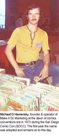 Yeah, that's me in the photo shown to the left, taken at the 1973 San Diego Comic Con!
 Also, if you are a Facebook member and would like to join my Facebook Network, feel free to send a
  Talking about comics: if YOU are a comics creator, (writer, penciler, inker, colorist, letterer, etc.), OR even a Comics / Magazine Publisher, feel free to contact me regarding YOUR works for a possible mention / review!
 WEB PAGE NOTE: This blog post is written for the IE Browser standards. Chrome, Safarai, Netscape, Firefox and the others serve the page up differently. The screen display resolution is best seen at the setting of 1024 x 768.